Web Page Design for Designers


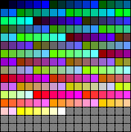
To be sure that your images don't dither on Mac and PC systems running 8-bit colour, you need to use colours from the 6x6x6 'web-safe' palette for graphic images. This includes GIFs used for background images as well, although these are handled slightly differently - the same GIF file used as a foreground or background image can look quite different.

Some UNIX systems use a more restricted 5x5x5 palette using 25% steps instead of 20% and the so-called 'web-safe' palette will dither on those, but they are comparatively rare.

This page is about getting the best out of what is available for the majority of people using PCs and Macs.

As these pages are about producing graphics that will work on 8-bit systems, some of the examples only make their point if viewed in 8-bits (256 colours).


20 colours are reserved by Windows.

The 6x6x6 'web-safe' palette has 216 colours corresponding to 20% steps of R, G and B.

If you subtract 216 from the 256 colours possible on an 8-bit system, that leaves 40 slots. These 40 colours do not vanish into the ether, but how they are used by different computers and browsers, or even versions of the same browser, is not consistent.

On a Windows 95 computer, 20 of the spare slots are 'grabbed' by the operating system. They are 'reserved' for displaying interface items.

The 20 remaining slots can be forced into picking-up additional 'non-safe' colours that might be contained in a GIF saved with an ADAPTIVE palette for instance. Doing so doesn't magically make them 'safe', but it does make them usable.

But beware! Windows palettes are always changing depending on what else is on the screen. Often, a graphic with non-safe colours will look OK on one page and not on another. Test it!

You can impose colours on most of the spare slots on a Mac to the same end, just two slots are resewed for black and white.

Using the extra slots is never totally predictable, but with a little experimentation can give useful results.


Greyscale Graphics on Web Pages


Mac Greys

If you are looking at this run of greys on a
Mac in 8-bits, they probably won't be dithered
even thought they are not in the web-safe
palette, they are from the Mac System palette.

In Windows, they will looked dithered.


Windows Greys

This run of greys comes from the
Windows 95 default palette.
In the context of this page, it will
looked dithered, but isolated on a
page
by itself, will look correct.

The 'current' palette changes
according to what else is on
the screen at any time, only the
web-safe palette is locked.


By using this dither pattern,
you can simulate intermediate greys,
or colours, but at a price.
These patterns do not compress.

The 6x6x6 web-safe palette has only 4 neutral greys (plus black and white) which can make the display of black and white pictures tricky.

There are extra greys made available by the computer's System Palette, it's just that they aren't the same greys on Mac and PC.

These diagrams show the extra greys added into the free palette slots, (but don't take the positions literally). There are 12 equal steps in the Mac palette and 18 in the Windows one so, apart from black and white, the RGB values are different.

In an image where any of these greys are used as large blocks of solid colour, there will be an obvious dithering for somebody.

In an photographic image where everything is dithered anyway, it doesn't matter.

If you MUST use a large solid area of grey, use the web-safe greys. Intermediate grey tones can be produced using a pattern - which is really just a non-random dither - but be aware that it will not compress efficiently.

The LZW compression algorithm used in GIF files works by counting the number of same-coloured pixel in a horizontal line and inserting a reference to the colour and the pixel count instead of mapping all the individual pixels. With a pattern like this, the compression routine can't do its job because EVERY pixel is changing. The 'compressed' version may be even larger than the original.
In the 'dither pattern' diagram, the row of six squares shows the web palettes 'neutrals' where the RG and B values are the same.

Below it, intermediate squares are produced using the dither pattern but it is virtually undetectable.

The same technique can be used with any colour combination although the colours need to be close to one another to avoid an obvious pattern.

To use such a pattern with Photoshop, draw a small area with the Pencil Tool, select it and use Define Pattern in the Edit Menu to capture it. When you fill an area with the Fill Menu Command or Paint Bucket, choose the Pattern Option.


JPEG Cat - 30K  JPEG Cat

4-Bit GIF Cat - 16K  GIF Cat

Here is the same photograph of a cat saved in two formats.

Top Cat is saved in JPEG format from a greyscale Photoshop file and weighs in at around 30K in file size. It will look fine on a 16 or 24-bit system but will be dithered by the browser on an 8-bit system. Notice how the white area between the ears has stray dots.

The lower cat is saved using an Adaptive palette with the bit-depth set to 4 and Diffusion dithering.

This time the cat looks identical at any bit depth and BETTER than the JPEG at 8-bits and with only half the file size.

WHY?

A greyscale image has 256 steps of grey. This is gross overkill as the steps are too subtle. Reducing the bit-depth to 5 (32 greys) or 4 (16 greys) gives virtually the same result, but a much smaller file size.

For this particular image, there is little difference in file size between saving with dither ON or dither OFF in Photoshop. Dither ON gives less posterisation.

umbra

This logo uses the same technique. The soft shadow is rendered quite nicely.

It will look slightly different on a Mac or PC, but acceptable on both.

The extra greys have been supplied by the appropriate System Palette. Had the logo been mapped to the 216 colour web palette, it would have looked coarser.

So, although the image is not identical across platforms, it will generally look better than one that is!


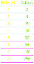
Reduced Bit-Depths


Bit Depths Chart

Note. One 'colour'
at each bit-depth
is always BLACK

Reducing the bit depth of any GIF file will reduce file size and make it load quicker.

I have also found that GIF files that have been saved with an ADAPTIVE palette and a low bit-depth - 4 or less - are less prone to dithering. They seem to fit-in better with the spare slots in the palettes.

One thing to watch is that the Adaptive method of saving index files in Photoshop often gives subtle, but undesirable,colour changes.

You can be painting away quite happily using web-safe colours from the 6x6x6 swatch and when you change them to INDEXED, the colours have drifted off by a few digits and appear dithered.

You should check this with the Eye-dropper tool and the Info palette. Colours should only contain RGB values of 0, 51, 102, 153, 204, 255 to be safe.

To fix them, choose the COLOR TABLE menu item in Photoshop. This lets you click on individual colours and tweak them back on course. Don't forget to SAVE the fixed file.


Now, have a look at this seemingly impossible situation.            


menunext